REBECCA WASILEWSKI
⏬ scroll ⏬


⏬ keep scrolling ⏬


WITNESS
Live, improvised music recorded at the direction of Rebecca Wasilewski and David Roush; Film edited to musical excerpt by Rebecca Wasilewski
Trouble viewing? Click here: https://vimeo.com/322138878
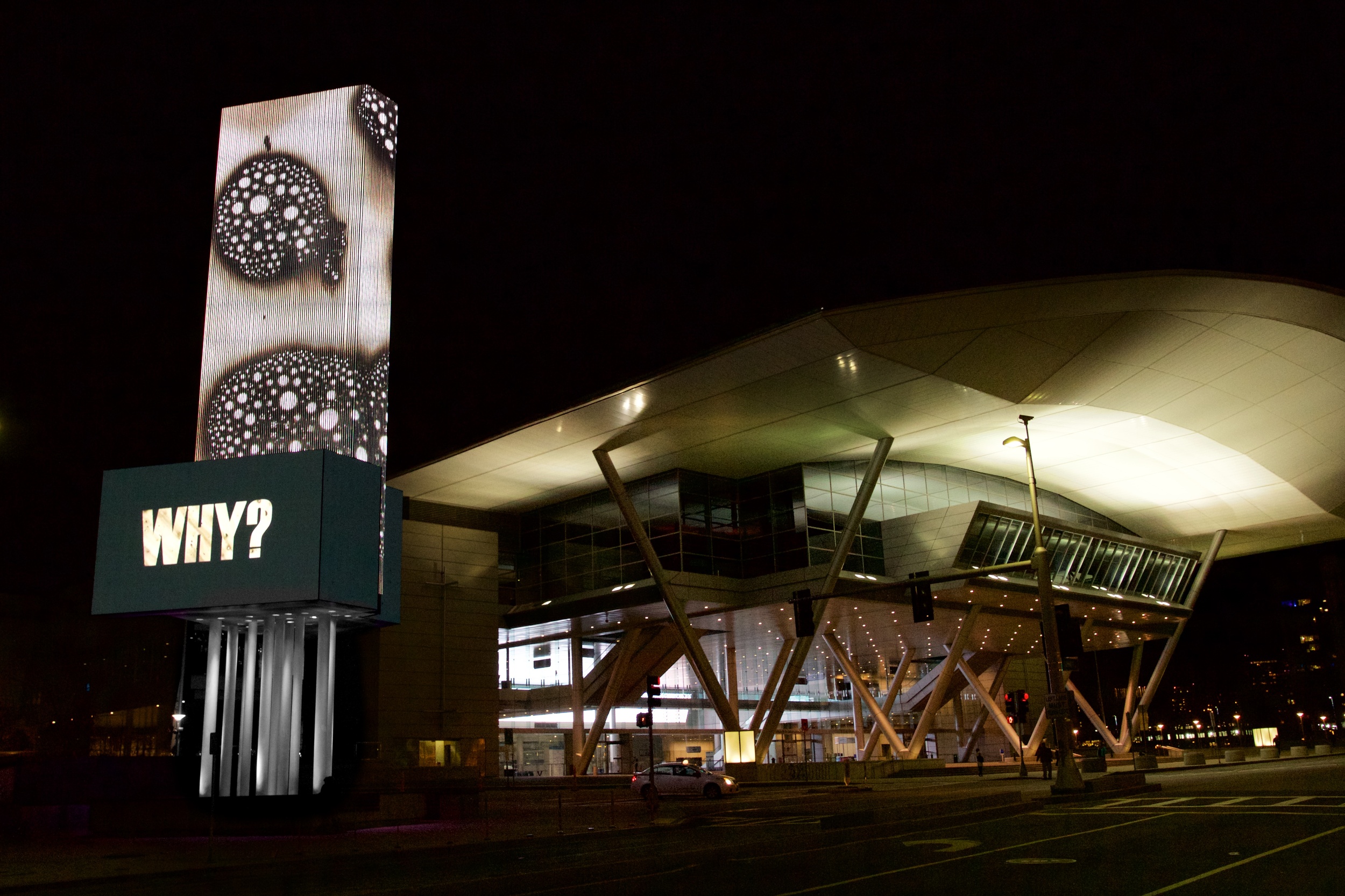
Good / Better : Why / Why Not? custom video piece for Art on the Marquee, Boston, MA
Good/Better : Why/Why Not? is a visual exploration of a minor epiphany that has caused major effects in my life. Curious and cautious by nature, I have been well served by always asking why, but that eventually lead to over-validating all my decisions. I was getting bogged down by justifying daily minutia, choices in my art practice, and major life decisions. A few years ago, I made a hasty, ridiculous drawing to use as a postcard. Anticipating a confused reaction, I added, “Sometimes it’s better to ask why not?” and dropped it in the mail. This revelation became a breakthrough in and outside the studio. By inverting the Why?, our patterns are disrupted and analyzed, and new actions are provoked. Why not? gives greater flexibility in responding, deciding, and creating. Also, listing reasons why something should not be often reveals clearer and fewer choices, leading to quicker and more instinctive resolutions.
In Good/Better, this playful but profound dialogue unfolds. The lively, metaphoric video demands attention. Why? fades in slowly and is prolonged; it is the mental rut we unconsciously trace again and again. That line of thinking is cut, there is a dark pause, and finally Why Not? replaces Why?, attacking our query from the opposite direction.
To develop this custom marquee piece, I teamed up with Ben Pender-Cudlip. The imagery in Good/Better is previously unseen footage from our ongoing film series Chromatic Aberrations. The HD video was shot live and uses no animation or digital manipulation except for speed adjustments. I hope viewers remain mentally engaged with Good/Better’s broad implications well beyond its short duration. At the very least, the piece substantiates itself in a most literal way: A passerby may wonder, “Why? Why is there such a strange video playing on these enormous public screens?” The simplest counter is, “Well, why not?”
digital preview for "Good/Better: Why/Why Not?" video art commission, Art on the Marquee
⏬ scroll til you can’t scroll no mo’⏬

Chromatic Aberration: Signs of Things to Come, short film, duration: 2:34min
In Brief: A complete piece on its own, this short film showcases a few different aesthetic landscapes that will be in the upcoming series of Chromatic Aberration short films. Each film will be 2-12 minutes long and will have focused imagery and scores to create an immersive viewer experience - each one distinct from the other.
The audio on this film is composed of authentic Numbers Stations recordings, used with permission from the Conet Project.
Full Artist's Statement:
“Signs of Things to Come” is the second short film in the collaborative series “Chromatic Aberrations” by director Rebecca Wasilewski and photographer Ben Pender-Cudlip. “Chromatic Aberrations” grew out of an experiment in which the goal was to realize the monochrome, abstract landscapes from Wasilewski’s paintings and prints in real motion and full color. Moving in real time makes it easier for viewer to truly experience these scenes and, more importantly, the concepts– moment by moment.
“Signs” features an assemblage of imagery from the most recent shooting sessions, paired with the audio of genuine recordings from Numbers Stations. Numbers Stations are shortwave radio stations characterized by unusual broadcasts, often at night, in which lists of numbers or incomprehensible coded messages are spoken either by what seems to be a real human voice or a speech synthesis device. These signals have been noticed all over the globe, have exceptionally powerful signals and long ranges, and contain no information about the transmitter location or for whom the transmissions are meant.
In “Signs,” the viewer gets a brief window into a variety of worlds, each carrying many allusions and possible readings: a nighttime sky, cosmic landscape, glimpse through a microscope, visceral innards. There is purposefully plenty of room for multiple interpretations. Matched with indecipherable Numbers Stations, “Signs” may confuse and thus provoke feelings of disconnection. However, as each moment unfolds with new visual and auditory information, viewers edit their theory of what they are meant to grasp. This intuitive striving for comprehension –the need to interpret, understand, and thus belong– is hardwired into human nature and truly connects us all. “Signs” is a distillation of this interpretive, seeking process. After all, what is art but a transmission of ideas, emotions, and complex information, put out into the world with a hope for understanding and thus connection?
Notes:
-The HD video was shot live in Wasilewski’s painting studio and uses no animation or digital manipulation.
- The audio on this film is composed of authentic Numbers Stations recordings, used with permission from the Conet Project.
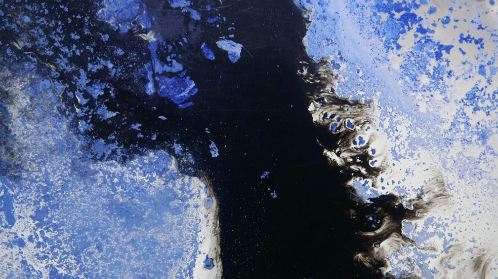
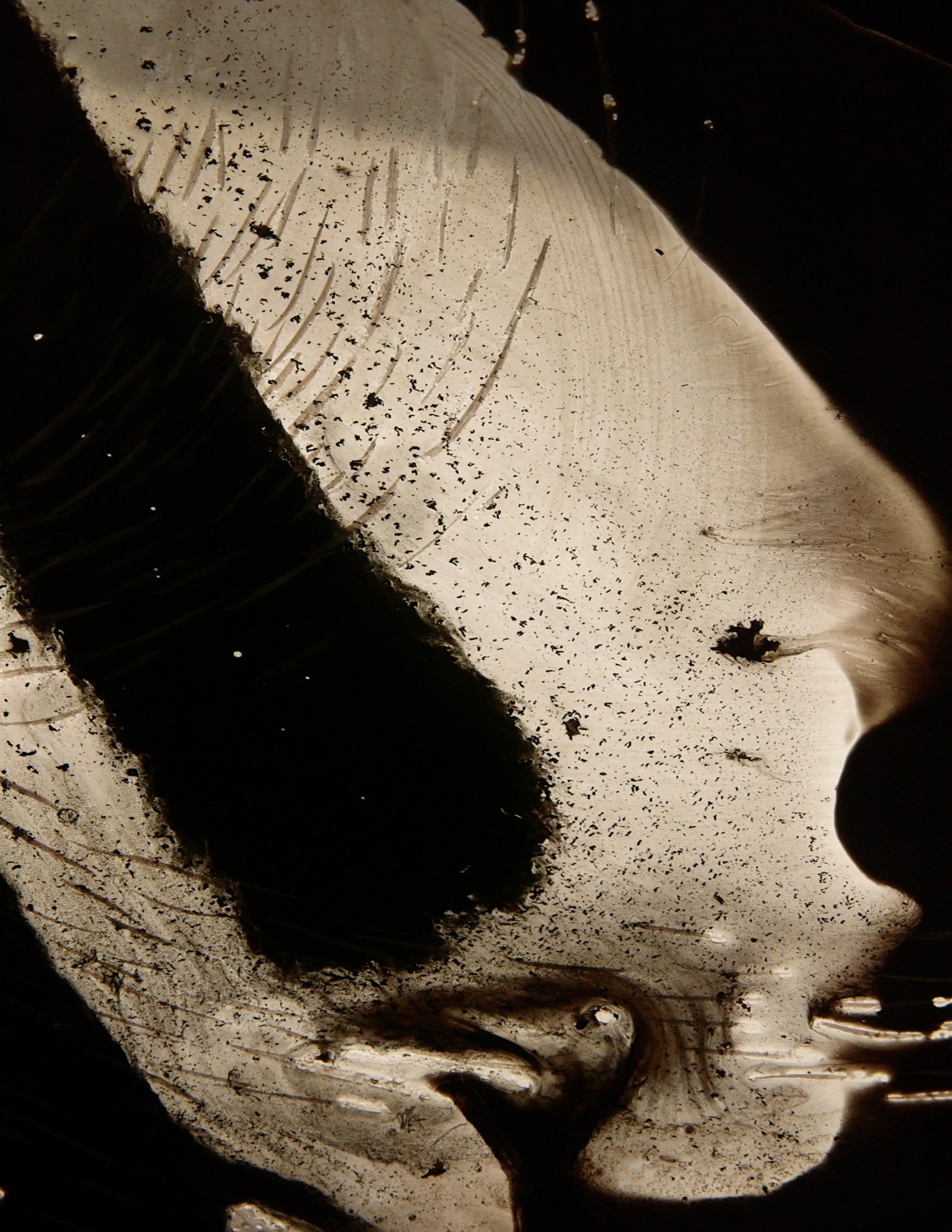
Signs of Things to Come (Chromatic Aberration 2) , Video Still

Signs of Things to Come (Chromatic Aberration 2) , Video Still
Chromatic Aberration A, short experimental film, duration 11:56 min
*sound is an integral part of this piece
This piece was an attempt to realize my prints and paintings in motion. Visually, it is not very focused and has technical issues, but musical duo Connector did such a fantastic job with the score that it is worth viewing in total. Headphones are recommended. This was a launch-pad for a second session of more directed shooting with improved technique.

Stop Telling Everyone How Pretty They Are, 2016
#yoursolutionisaproblem #newgrammar

Everyone Is Not Having More Sex Than You, 2016
#restonthebeach #normalizedlies
Stop Telling Everyone How Pretty They Are and Everyone Is Not Having More Sex Than You (2016) are the first two pieces in a new series that references and undermines certain visual and thematic trends of today. They are allusions to —but not mimics of— a pervasive social media format of a “pretty” photo paired with an “inspirational” quote. Unlike these memes that saturate Facebook, Twitter, and Instagram, however, Stop and Everyone contain unexpected messages in their text.
-
stop telling everyone how pretty they are : #yoursolutionisaproblem
Some make a habit of telling others how good they look as a well-intentioned attempt to boost self-confidence; however, this further ingrains the connection of physical appearance and self worth. Moreover, hyperbolic compliments are now so common they are expected, even obligatory, and so give rise to a new layer of anxiety if one does not receive enough praising comments. “Why hasn’t anyone told me I’m stunning or gorgeous!?” *refresh*
stop telling everyone how pretty they are : #newgrammar
#newgrammar is a literal reference to the increasing use of “they” as a singular pronoun in place of “he” or “she.” This new use has proliferated on the internet and is now accepted by many as a correct, non-gendered singular pronoun. More importantly, though, #newgrammar is a call for people to develop a new infrastructure (grammar) of relating to and uplifting one another—one that does not hinge on physical appearance.
-
everyone is not having more sex than you
This piece is not a call to action like Stop but rather a reassuring voice of reason. The glistening image of the beach at sunset calls to mind idealized notions of romance and sex. The text, however, undercuts this association and subverts the incessant message from commercial media that everyone, absolutely everyone, is having a lot of exciting sex all the time; and if you’re not, you aren’t living right, are missing out, and are decidedly a loser.
-
These works feature original photos by Michael McVey (used with express permission), which have not been digitally enhanced in any way. The photos were carefully selected not only to appropriately match each piece’s message, but also because they function aesthetically and formally on their own: undeniably lovely, with engaging compositions, and certainly part of art history’s long tradition of landscapes. This grounds the work. Although conceptually addressing today’s society and technology-based communications —which are slip-shod, flippant, and based in irony—Stop and Everyone are carefully crafted and earnest.
Finally, I hope these pieces remind viewers to get off the internet, out of their heads, out of doors, and to simply enjoy existence.

Cloudscape, oil on canvas, 24 x 18”

Cloud Column, oil on canvas, 24 x 18”

Cloud Study, oil on canvas mounted on panel, 10 x 6"

Linger and Hoist (Microscopic print series), editionable transfer, 5x9”, edition of 10

Sermon (Microscopic print series), editionable transfer, 6x11”, edition of 11

300 Octopuses (Microscopic print series), editionable transfer, 5x5” edition of 14

Contents of One (Microscopic print series), edition able transfer, 6x11” edition of 12

Microscopium (view from east), Site Specific Installation, Boston, MA
Vutec inks on PETG plastic, Vutec inks on mounted Lintec material
three suspended panels, each panel: 96 x 40”

Microscopium (detail view from east), Site Specific Installation, Boston, MA
Vutec inks on PETG plastic, Vutec inks on mounted Lintec material
three suspended panels, each panel: 96 x 40”
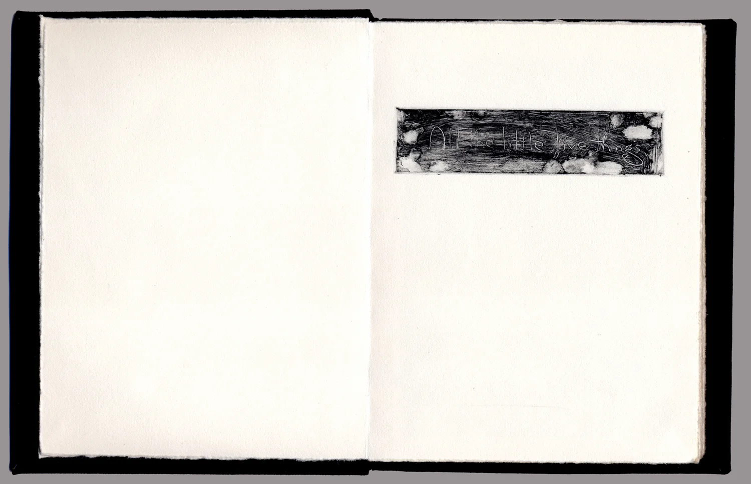
Title page of All the Little Live Things (artist's book)
Book info:
materials: book board, book cloth, etching ink on Rives BFK Lightweight Off-White paper
monotype plates: 9.5x 13.5cm; page size: 16 x 24.5cm
hardcover/adhesive binding, 14 pages
overall book dimensions when closed: 17 x 13.5 x 1.5 cm

All the Little Live Things, page 7
monotype, etching ink on Rives BFK Lightweight

All the Little Live Things, page 4
monotype, etching ink on Rives BFK Lightweight

All the Little Live Things, page 9
monotype, etching ink on Rives BFK Lightweight

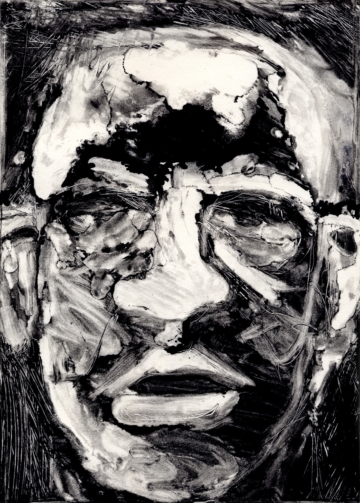
Us, No. 7
monotype: etching ink on Rives BFK Lightweight Off-White paper; compositions: 20 x 14.5cm; pages: 31.5 x 24cm
Us, No. 7
monotype: etching ink on Rives BFK Lightweight Off-White paper; compositions: 20 x 14.5cm; pages: 31.5 x 24cm

Us, No. 10
monotype: etching ink on Rives BFK Lightweight Off-White paper; compositions: 20 x 14.5cm; pages: 31.5 x 24cm